Shodle needed a brand that signaled scale, speed, and trust for a global tech audience.
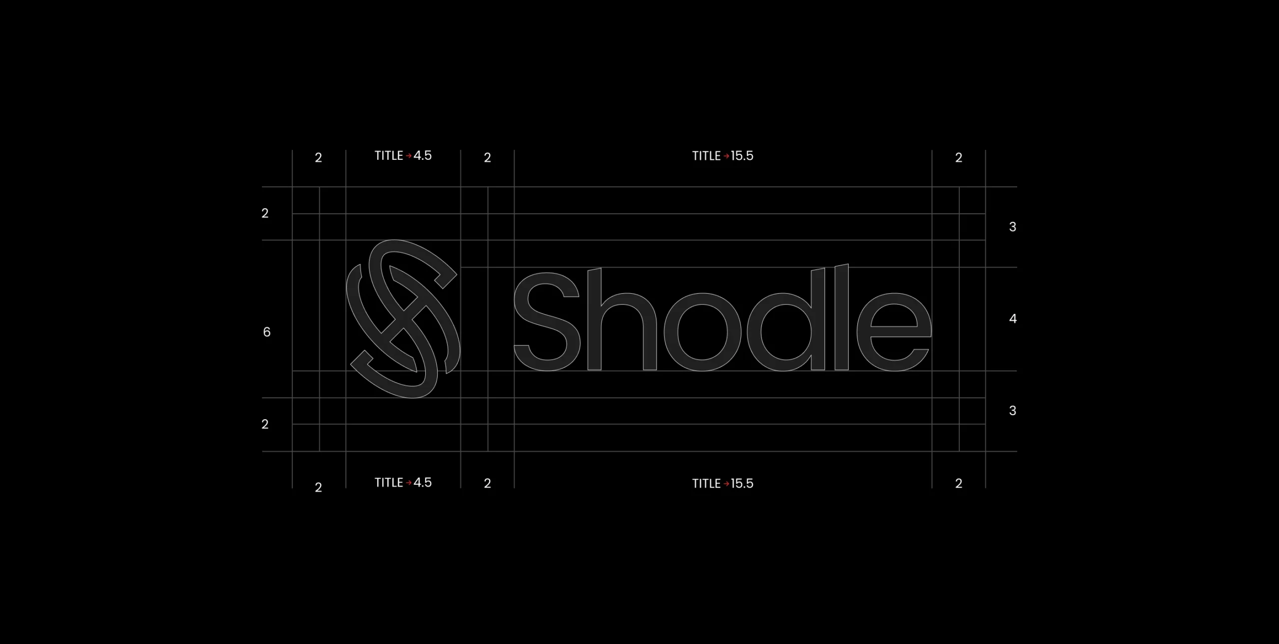
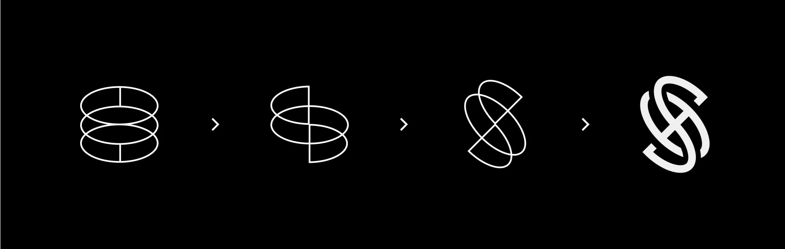
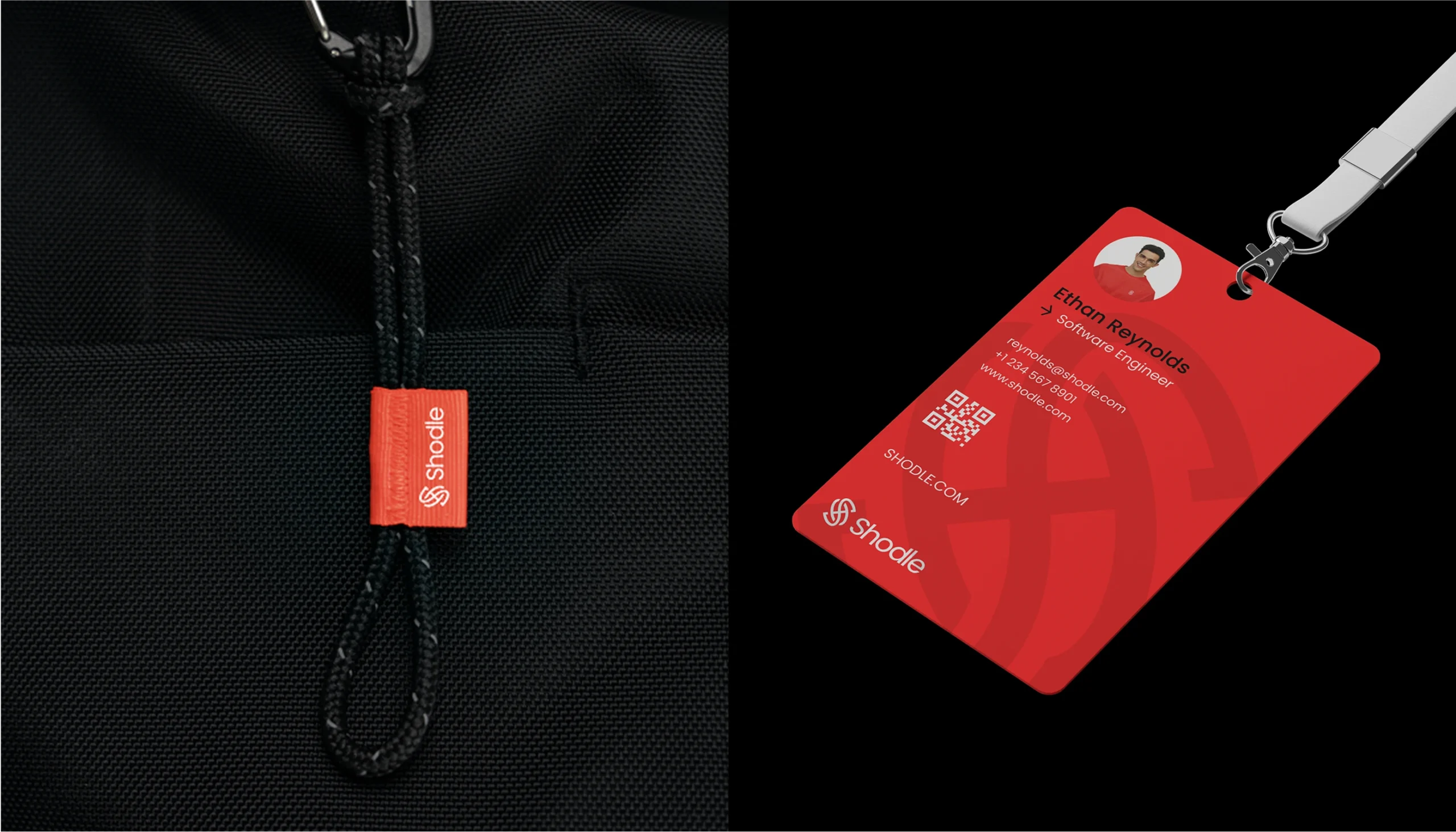
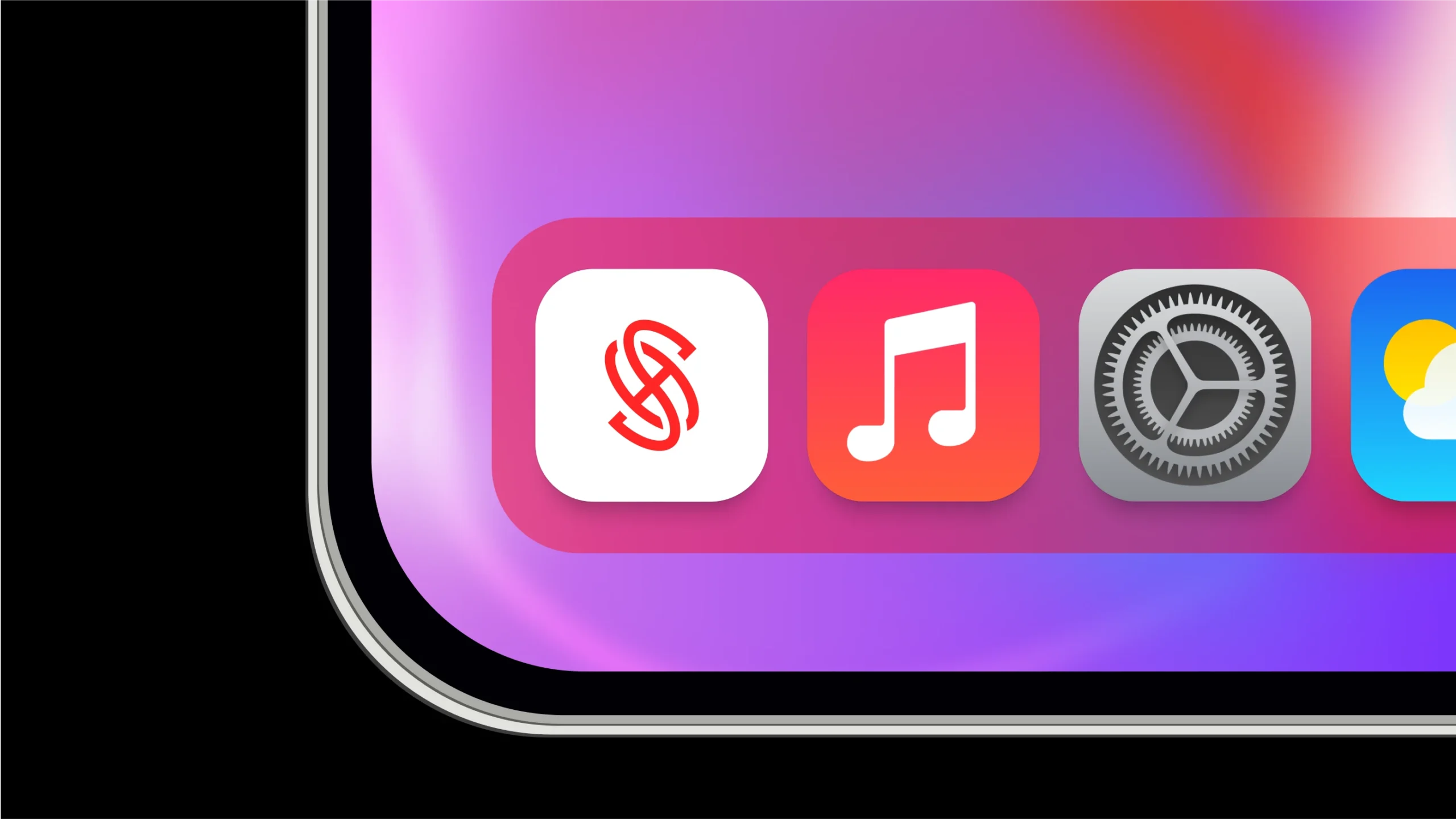
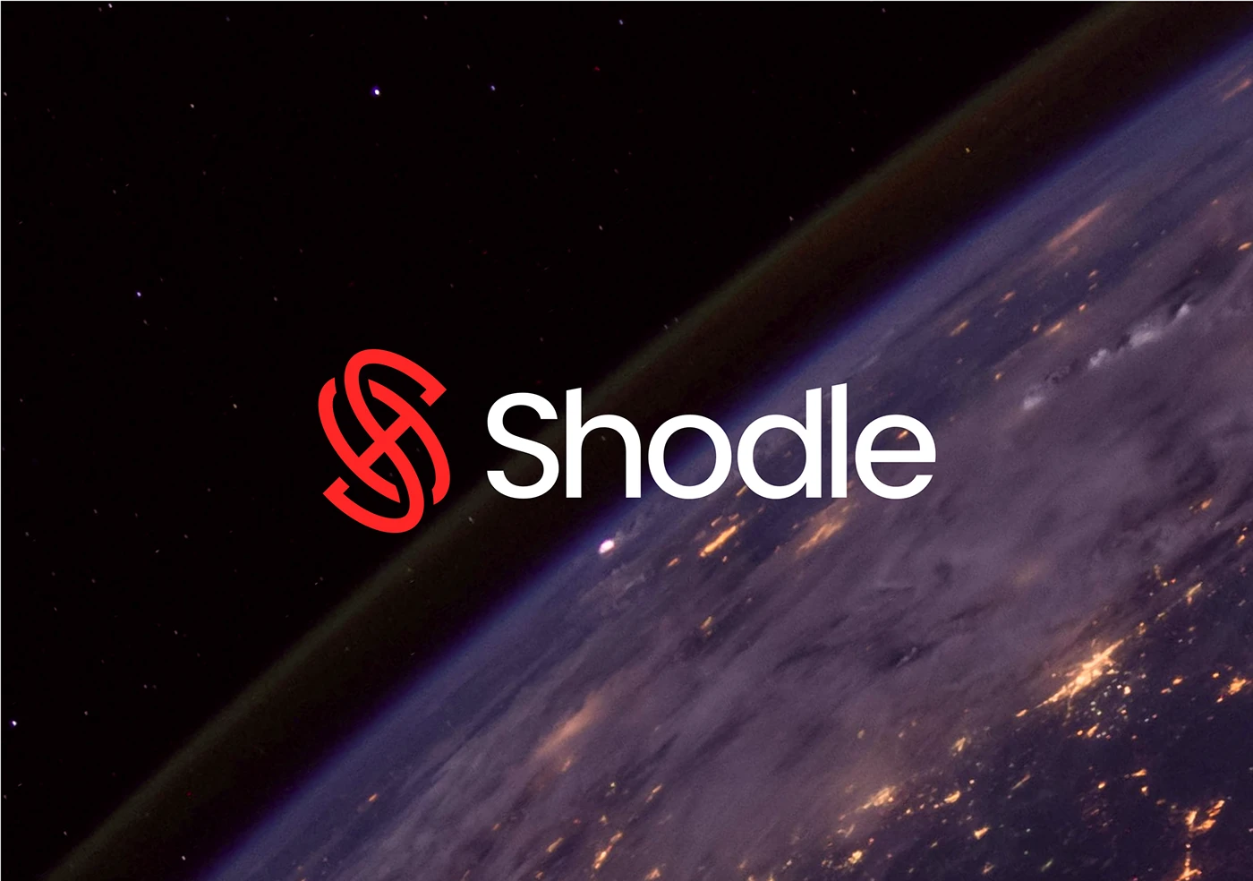
The identity centers on a sharp symbol mark and restrained wordmark to feel modern and reliable.
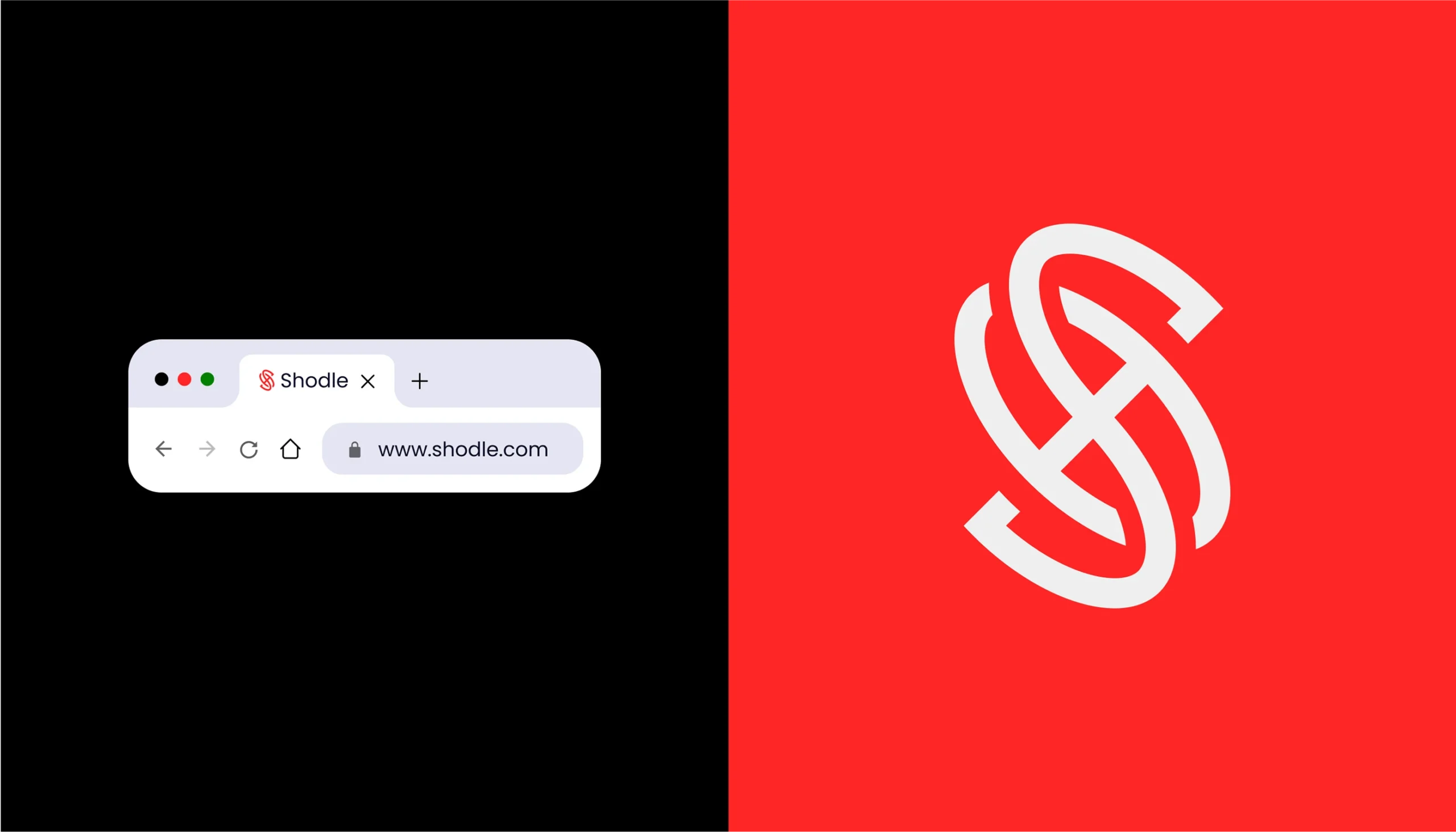
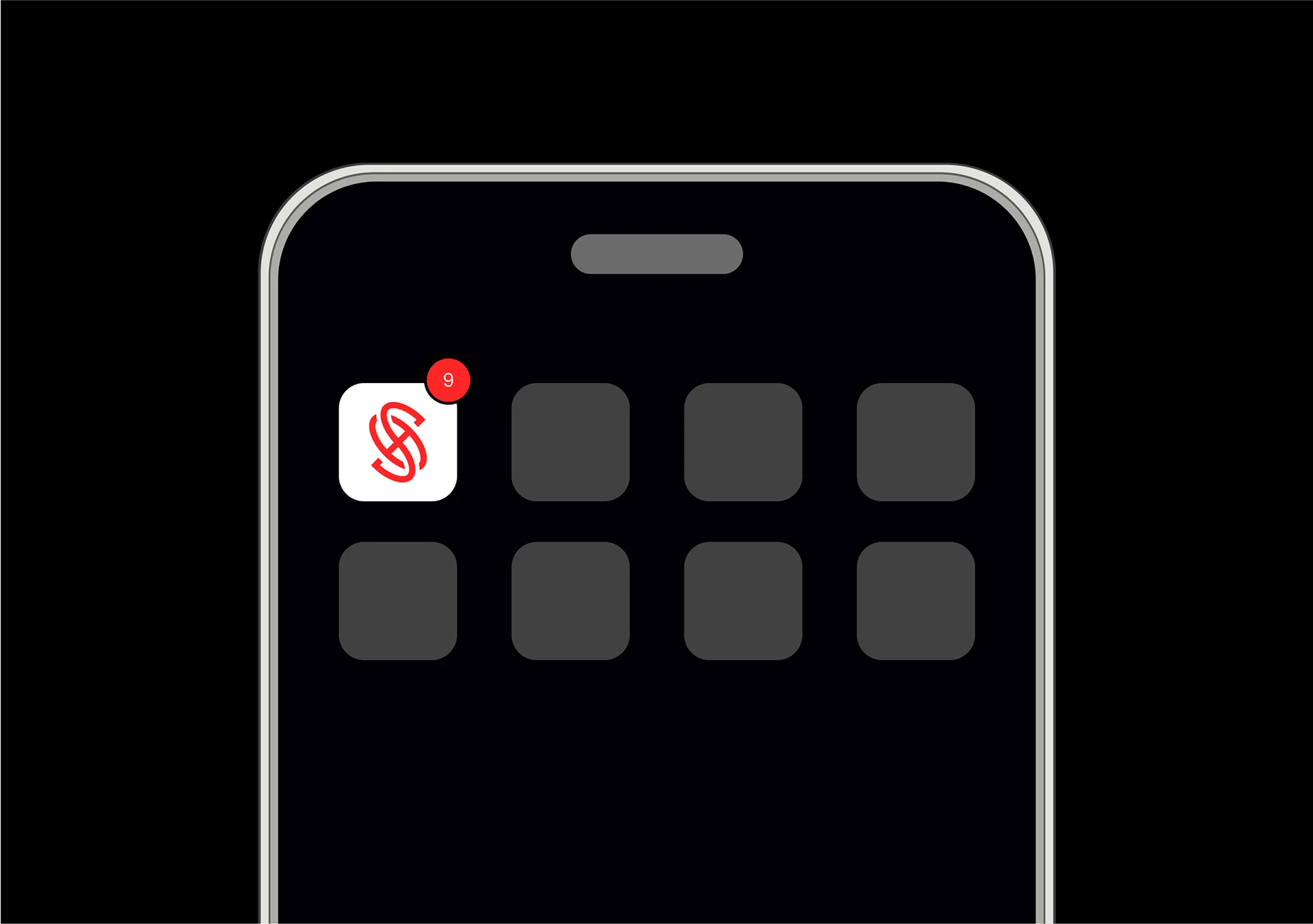
High contrast colors lead with red for action and confidence, balanced by dark space tones for depth and focus.
Typography stays clean and neutral to support clarity across product UI, marketing pages, and docs.
The space inspired visuals position the product as expansive and future facing, without noise.
Brand applications prioritize legibility, consistency, and fast recognition across screens.
The system supports growth while staying simple for daily product use.


 Skip to content
  Optimized by Seraphinite Accelerator
